Redefining the way you book your movie tickets
PVR Cinemas is the biggest multiplex chain in India with over 700 screens. its imperative for PVR Cinemas to maintain their lead by creating a bond with their customers and position itself as a chain of premium multiplexes.
Platform
WebResponsive
Services
UI UX DesignDevelopment
Industry
Entertainment
Out with old & in with the new
While all the physical PVR locations went through a massive renovation, their digital presence still required a revamp!

Grappus collaborated with PVR Cinemas to redesign a brand new website that not only provides a great online booking experience but also a loyalty program that ensures repeat customers by providing an improved omni-channel experience
Why the major
To generate brand loyalty amongst users to be a dominant brand
To keep up with the ever evolving consumer behaviour in the urban setting
To be recognised as a continuous innovator in the competitive space
To generate brand loyalty amongst users to be a dominant brand
To keep up with the ever evolving consumer behaviour in the urban setting
To be recognised as a continuous innovator in the competitive space
Capturing Ideas that resonate
A personalised and intuitive experience
Home Page
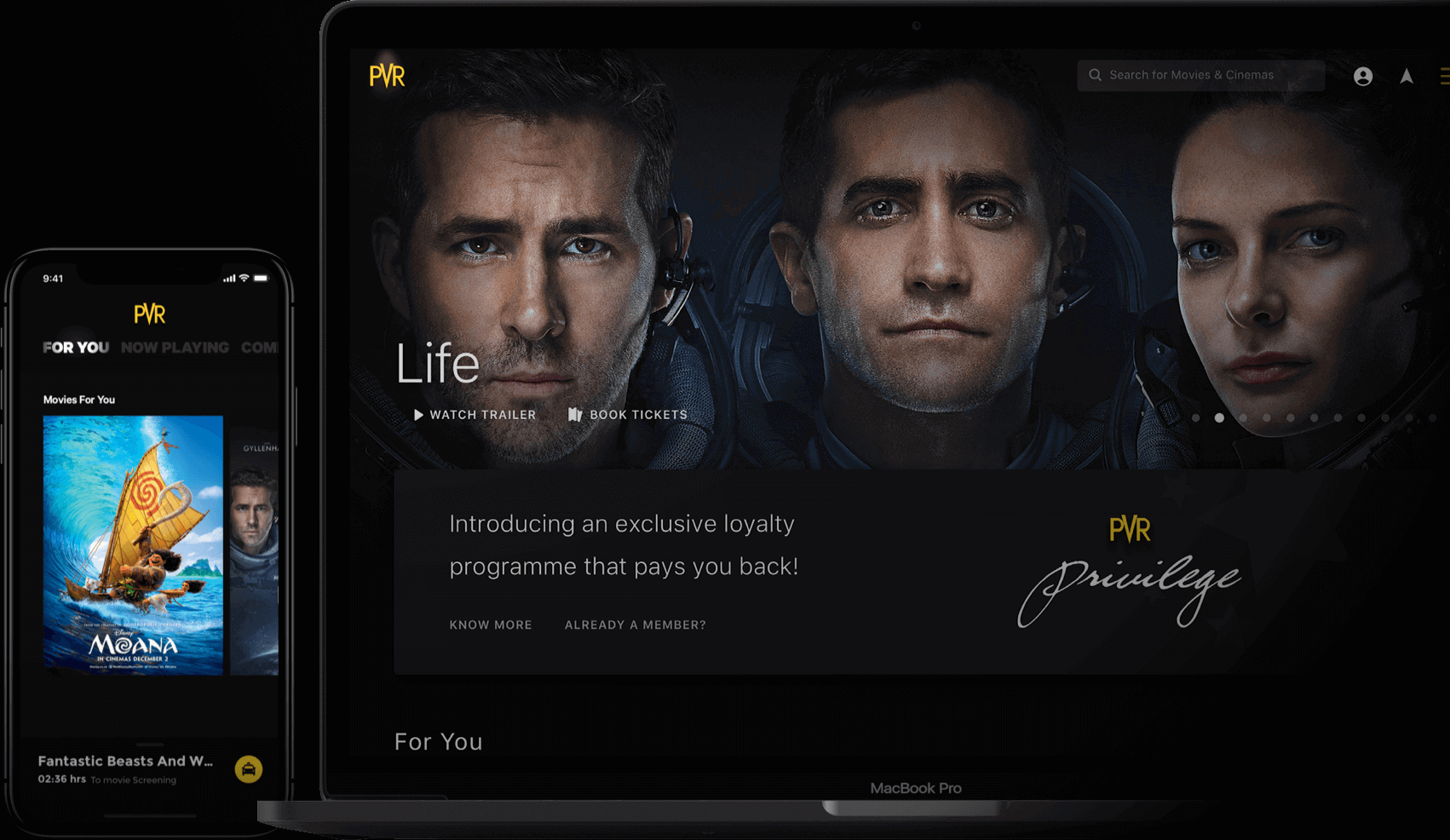
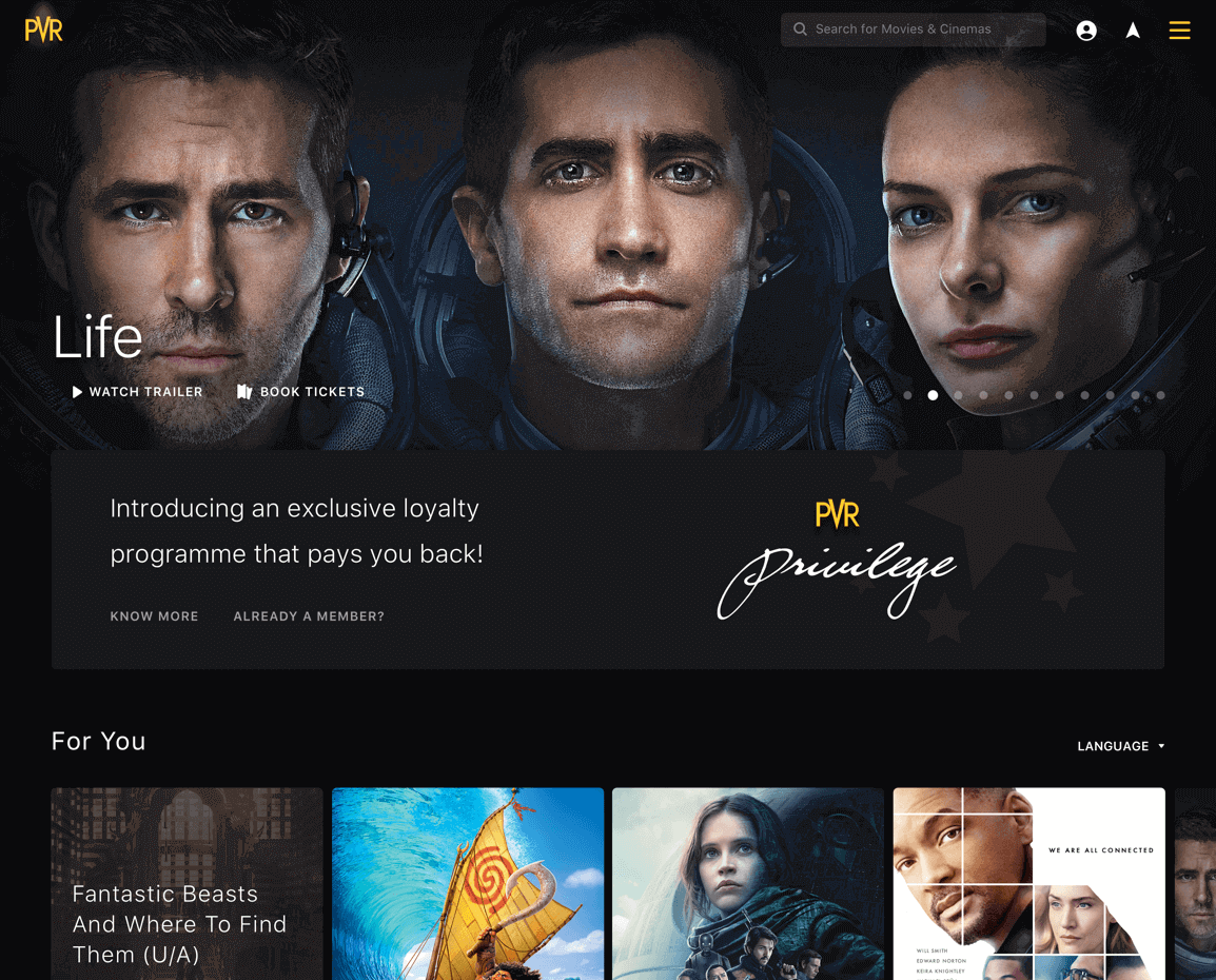
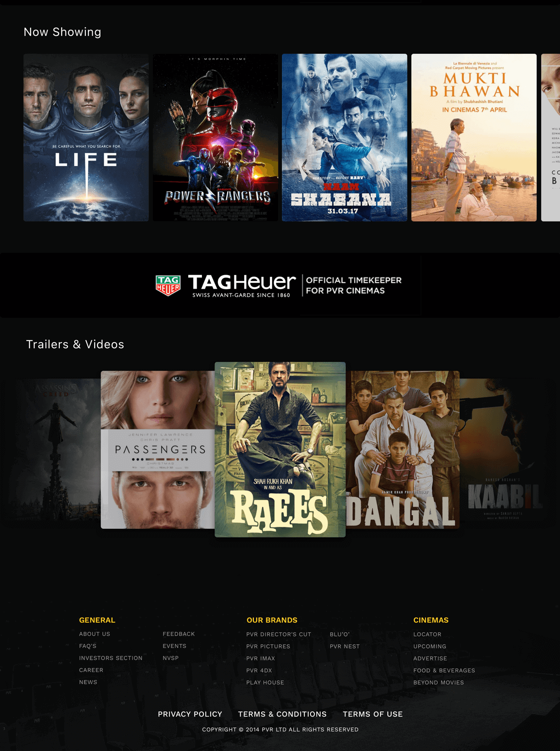
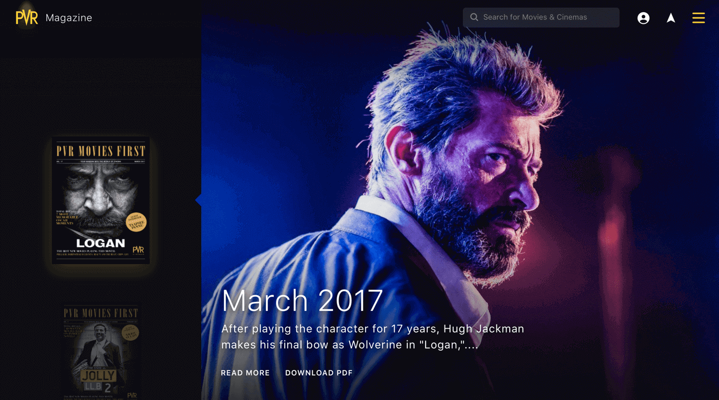
The hompage is an eclectic mix of all the main offerings (Movies, trailers etc), a universal search and recommendations. The homepage also highlights the privilege program aimed at generating user loyalty
An immersive booking experience
One of the biggest differentiators in the new version is the seat layout screen which is giving a 3d perception of a user inside the theatre while selecting the seats. With a 360 degree view exactly see how the screen is going to look like from the selected seats. The solution aims to create one unified experience throughout all physical and digital properties of the brand
PVR Privilege
This section was designed in conformity to the word ‘Privilege’. With the black and gold complimenting the sauve feeling of the section, the information was also organised in a manner that utilised the real estate effectively.
Privilege Member
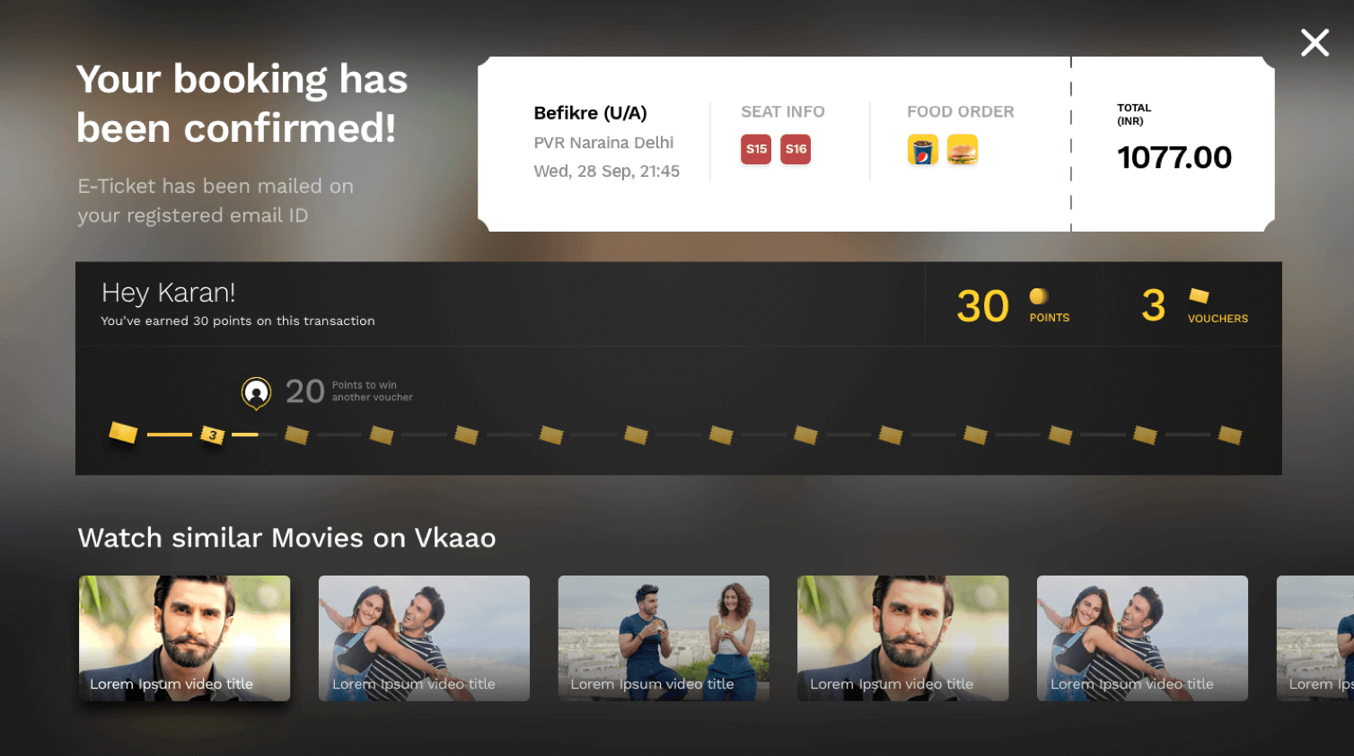
Apart from the feeling of being a priviledged, we focused on elevating the functionality too. The user here can see accumulated vouchers and a countdown to the next voucher
Privilege Upsell
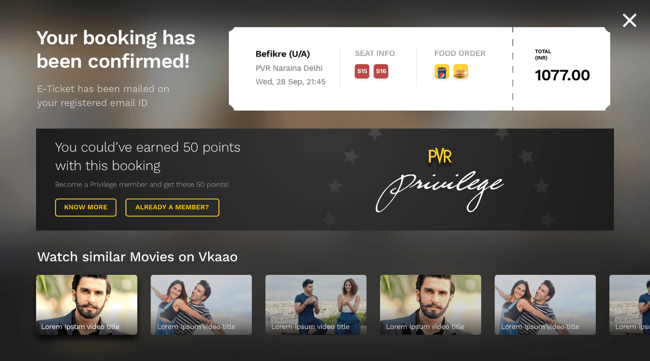
For a non priviledged user we used the post booking real estate to upsell the PVR Privilege feature. It tells the user the kind of saving that were possible on the current purchase and prompts them to sign up for the advantage.
Brand Language
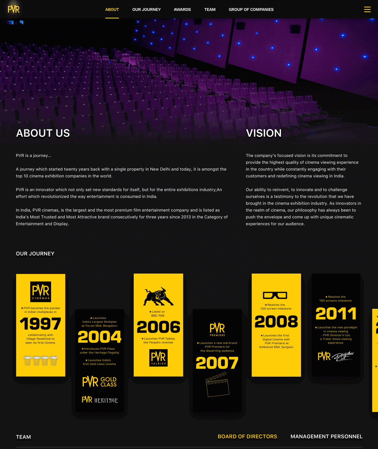
The dark theme compliments the real time experience of a cinema hall whilst differentiating the product from the existing competition. The accent colour -yellow- is a classic combination that elevates the aesthetic of the website further.